Google Brussels
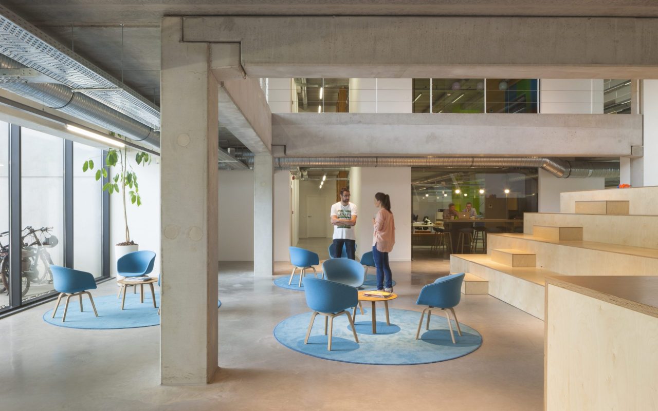
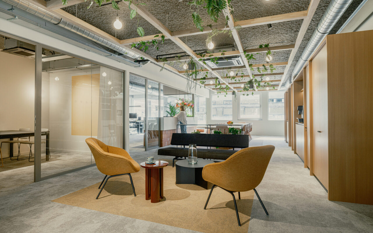
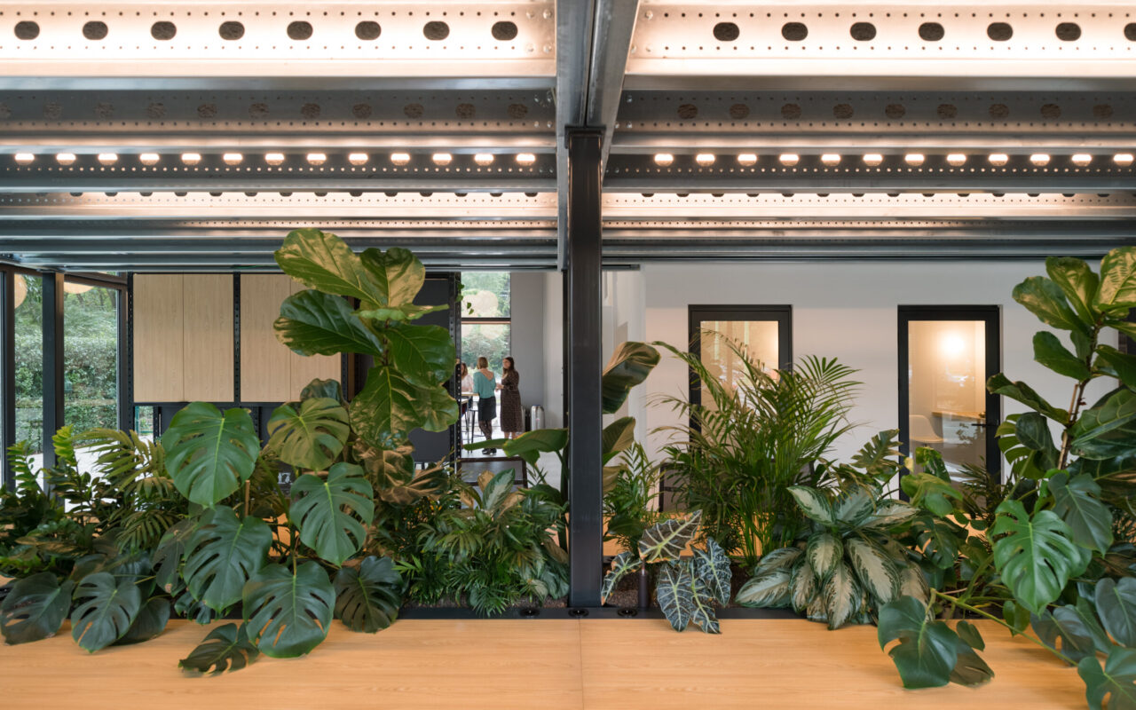
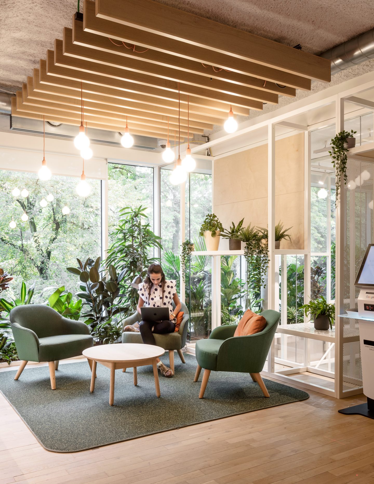
PUUR has designed a new office for Google Brussels: a fascinating world in which surprising materials, colours and structures are combined to form a harmonious whole.
Strategy
As with all its projects, PUUR presented itself as a critical, involved and constructive design partner who, in dialogue with the customer, came up with an innovative and creative solution that was in step with the people. Concept, functionality and innovative aesthetics were combined in the best possible way to enhance comfort, experience and sustainability.
Customer
Google, a pioneer, not only in terms of technology, but also in terms of working environments.
Brief
For the transformation of its Brussels office, Google had been scouting around for a design agency that could transform the modern but bland office building at the Leopold Park into a dynamic space for their employees. Drawing on Google’s traditions, the new office had to be an innovative, exciting and sustainable place where creativity and experience go hand in hand. A tall order, as you may expect from a pioneer.
End result
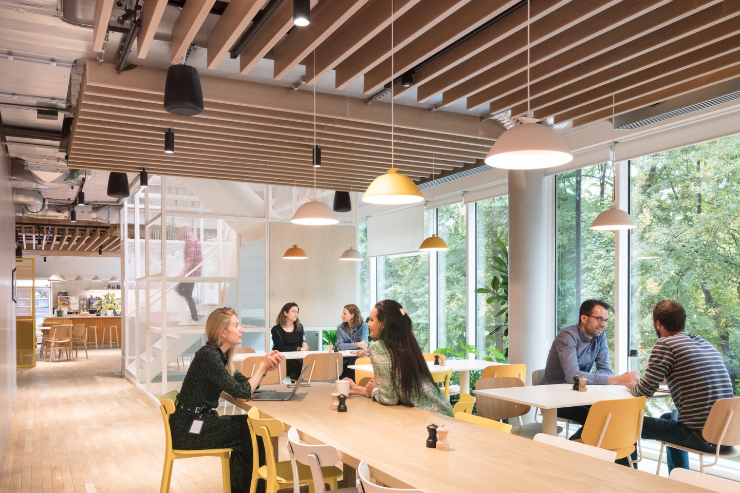
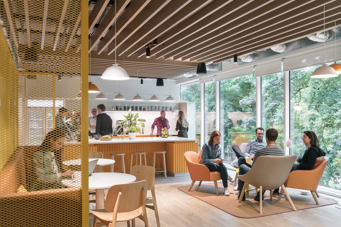
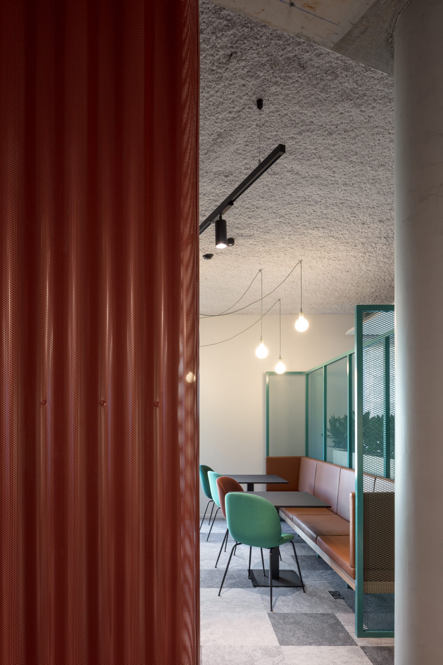
The result is a casual office space that ushers in a new, mature Google. It is an interior that does not impose itself in any way. Instead, it slowly reveals itself through a system of layers and levels.
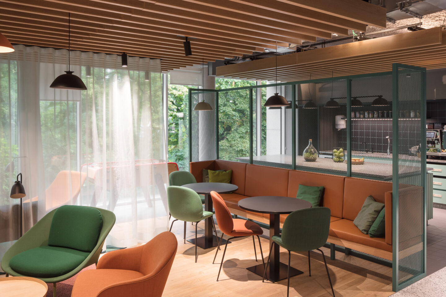
The 5 layers of the Google interior
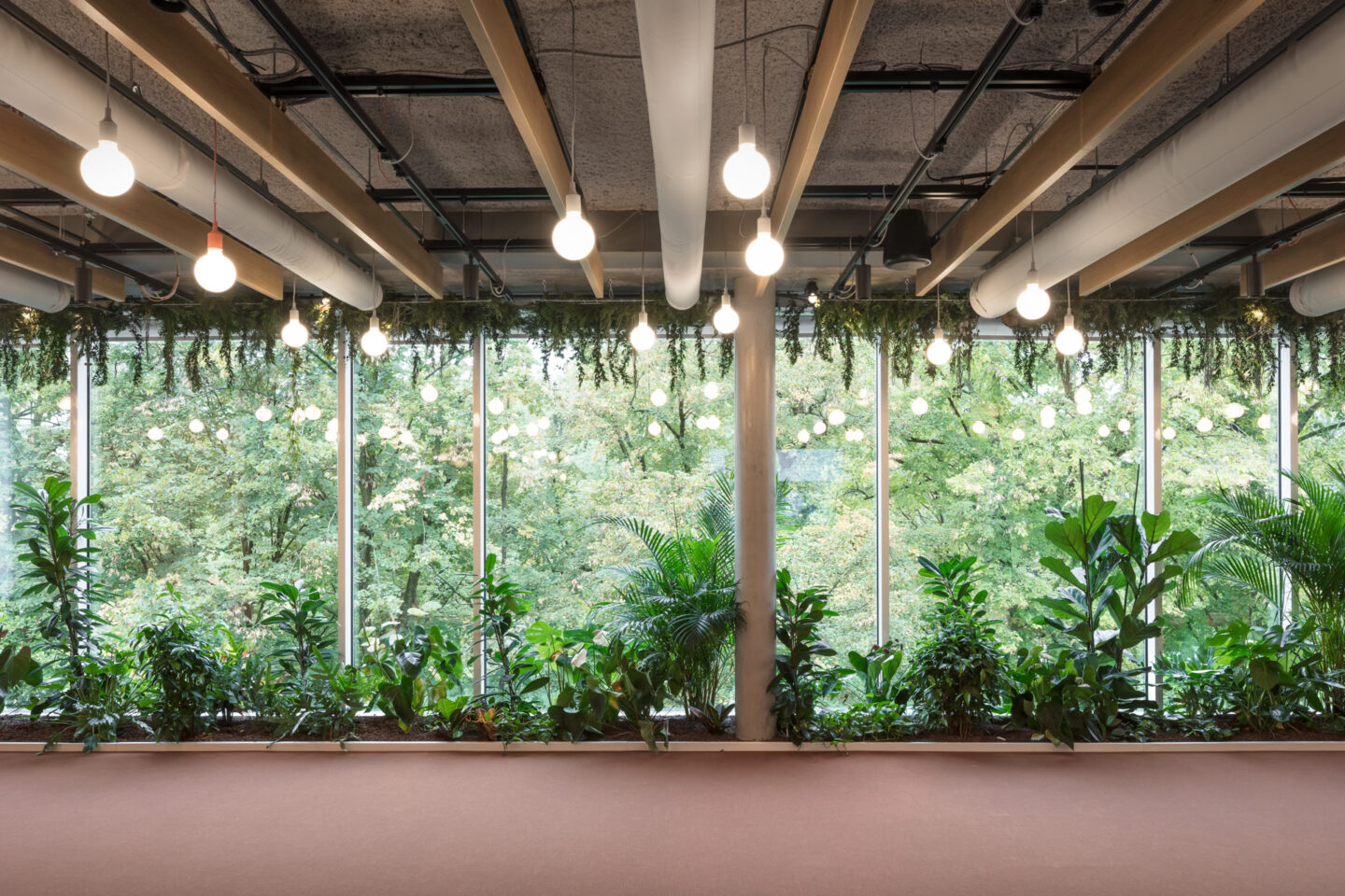
Context
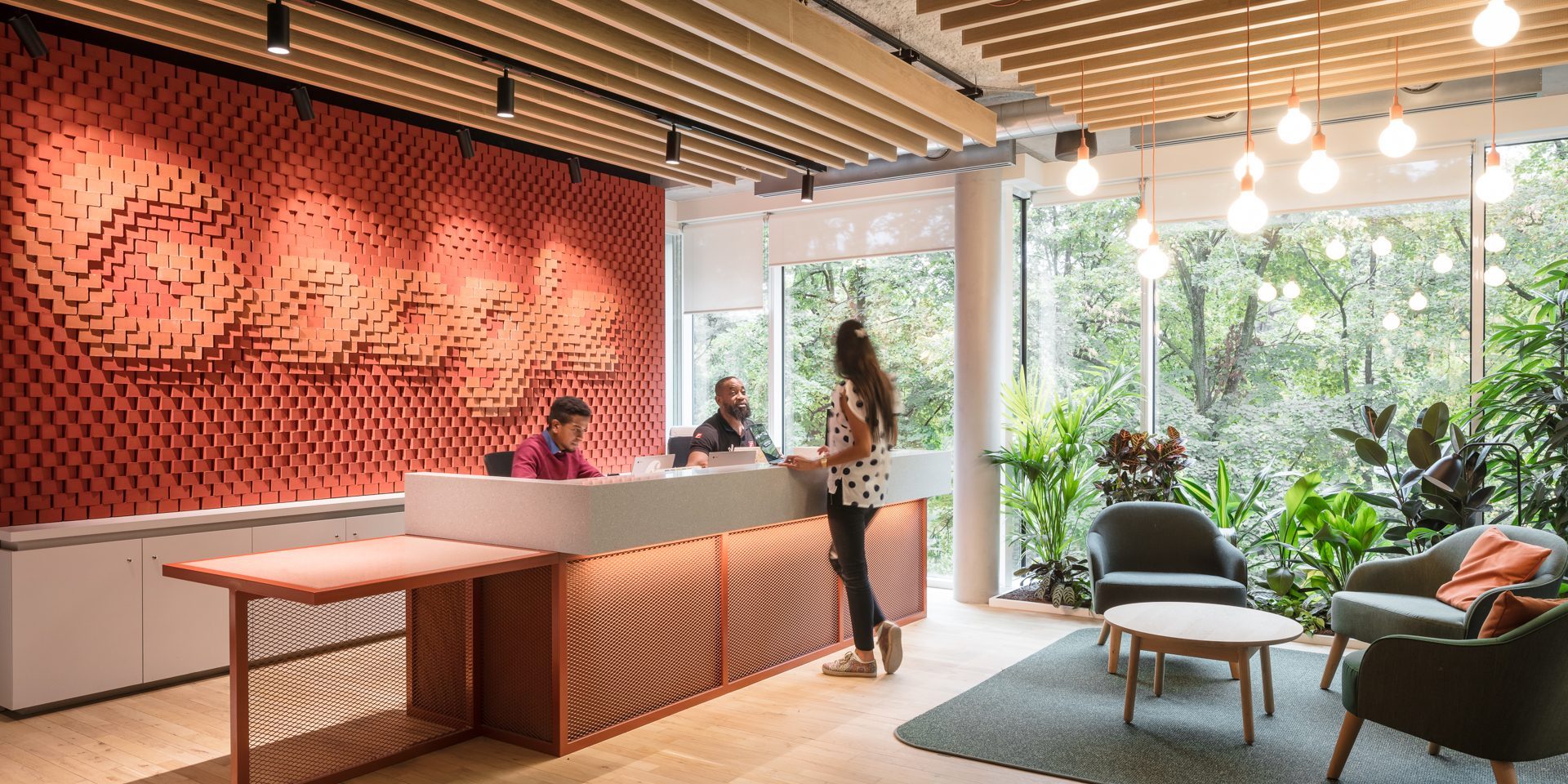
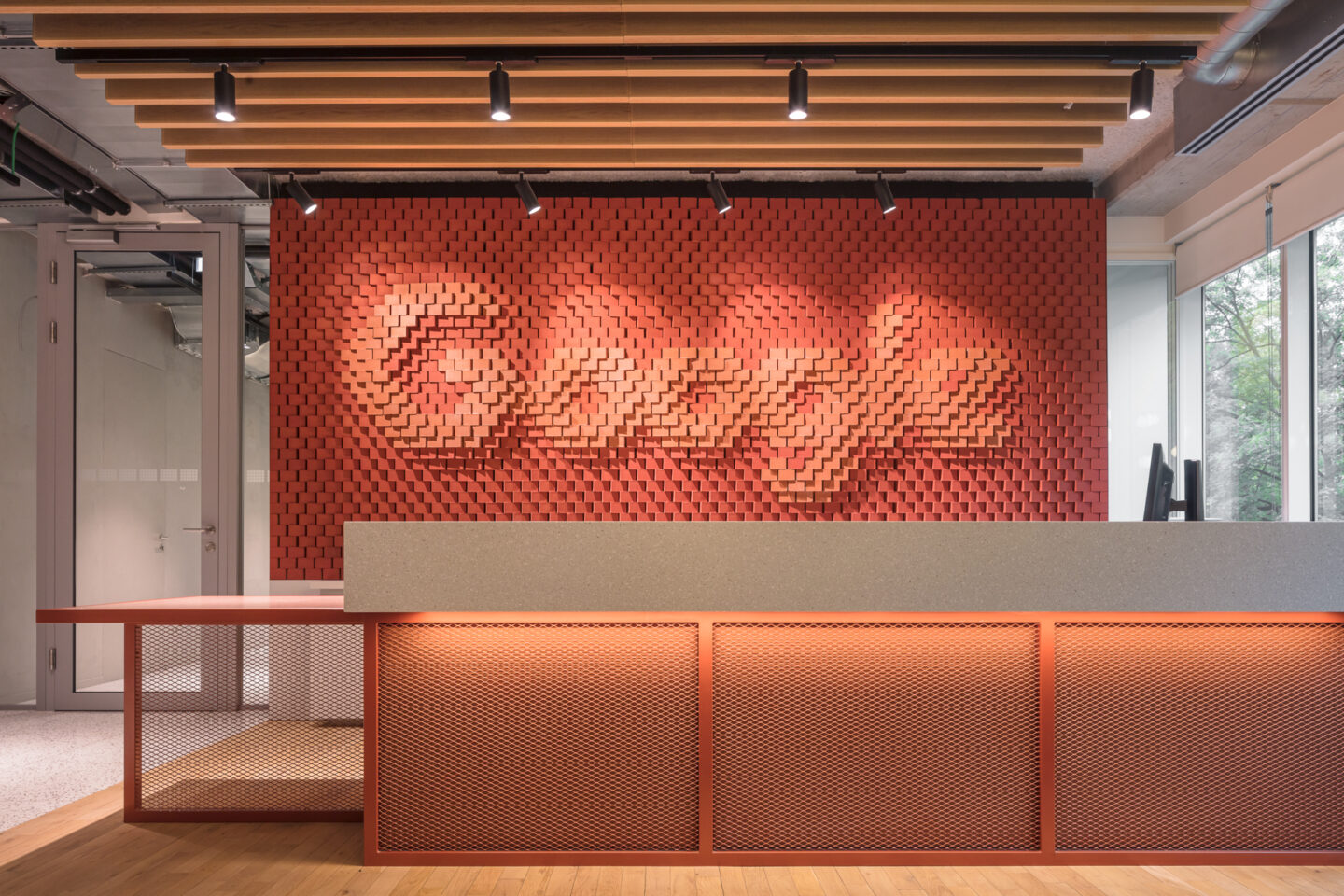
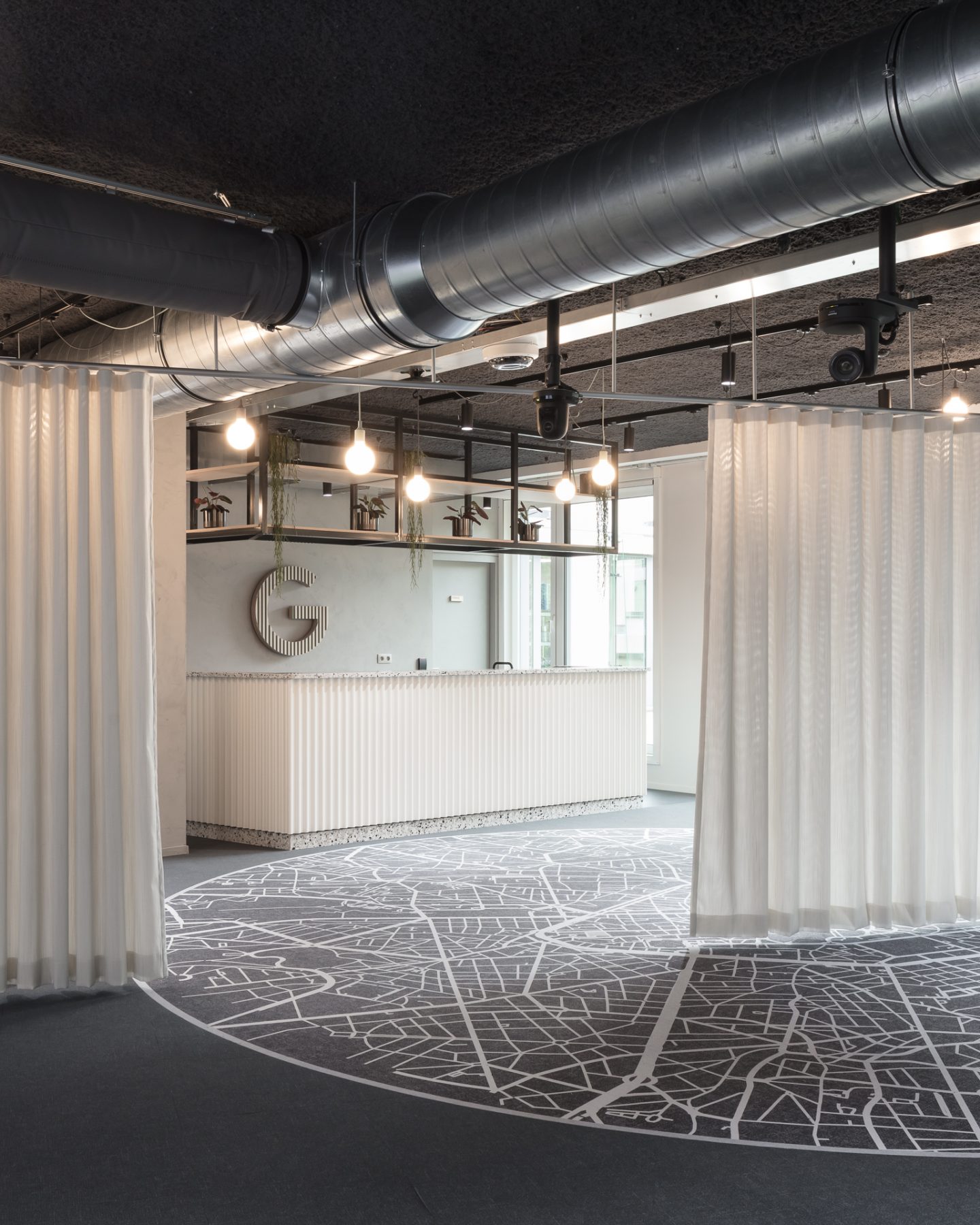
PUUR has placed the neighbouring Leopold Park centre stage of its design. As the original reception desk obscured the park’s view and much of the light, the new desk was turned a quarter turn, giving the feeling of always being connected to the park.
Structure
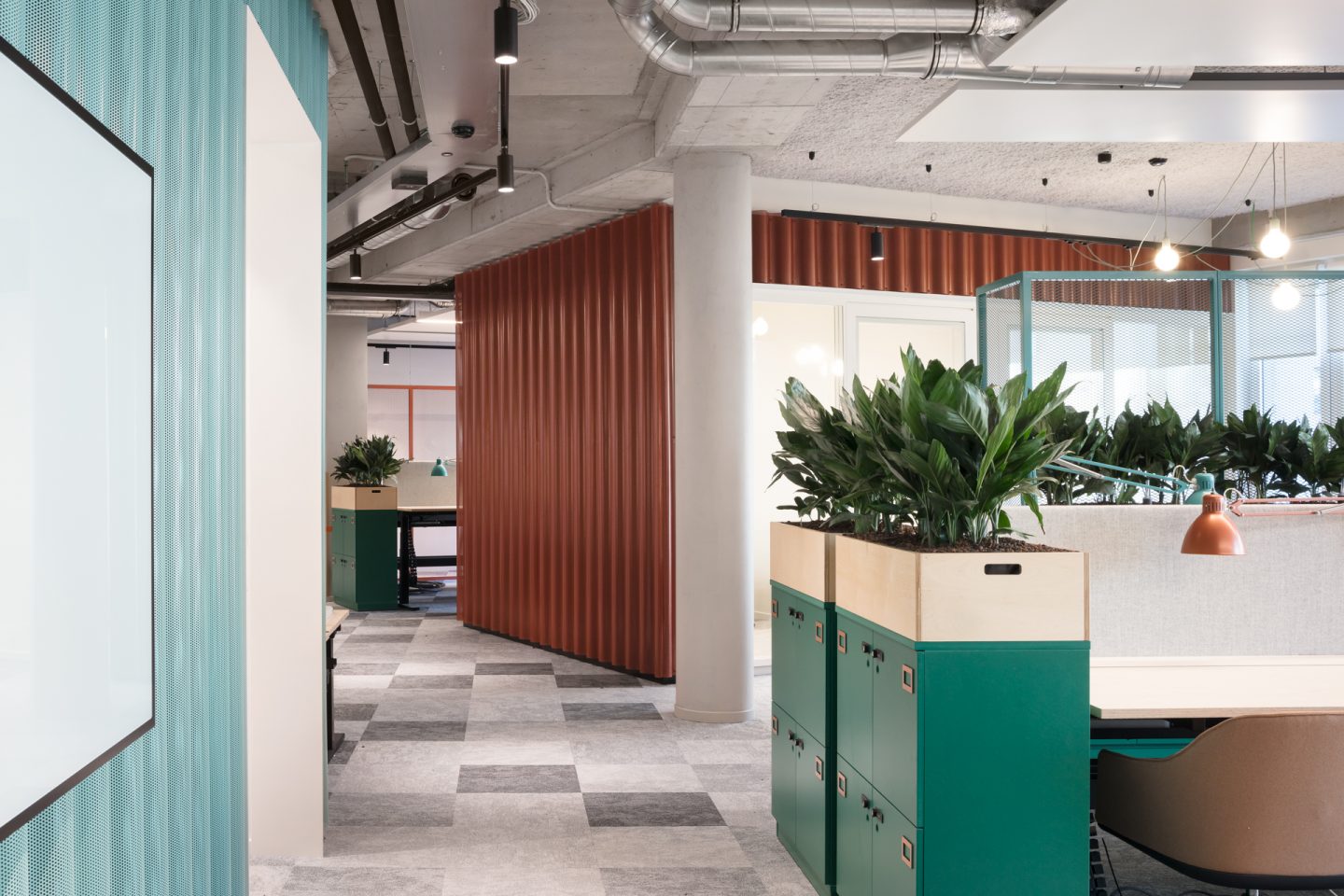
The existing office was completely stripped to expose the structure – and with it, the essence – of the building. System ceilings, system walls, artificial partitions and cladding for load-bearing structures were removed.
Materials
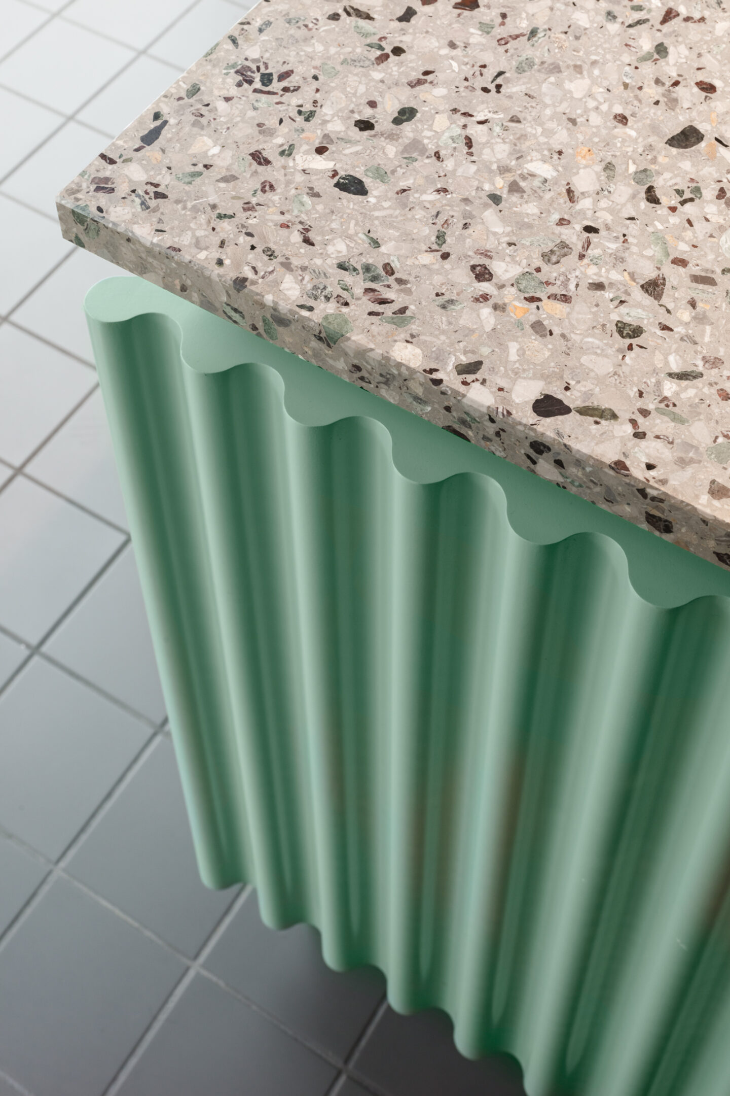
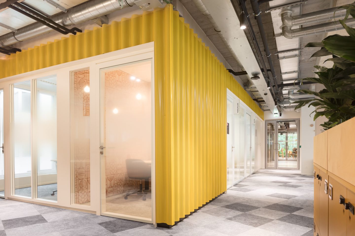
PUUR looked for innovative ways to integrate traditional materials into the Google office. The use of cathedral glass, which is still found in many old Belgian buildings, is a case in point. The walls of the meeting rooms were made of this ‘cloudy’ glass to offer a certain degree of privacy.
Special features
Thanks to a number of special features, the interior was given a new dimension. The 2 eye-catchers are:
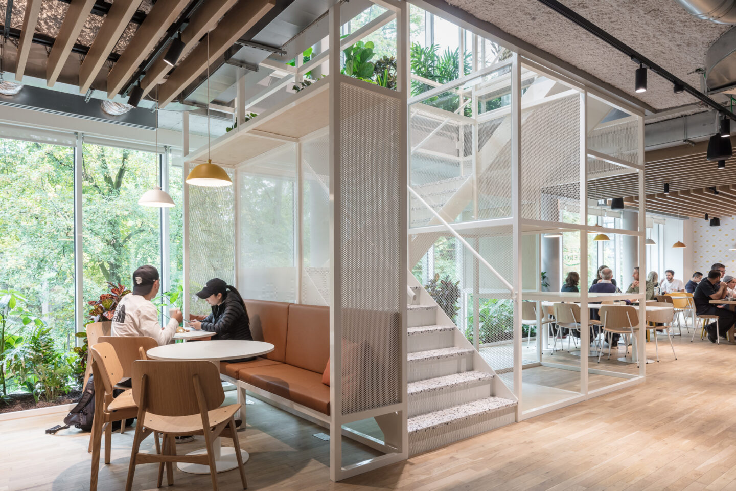
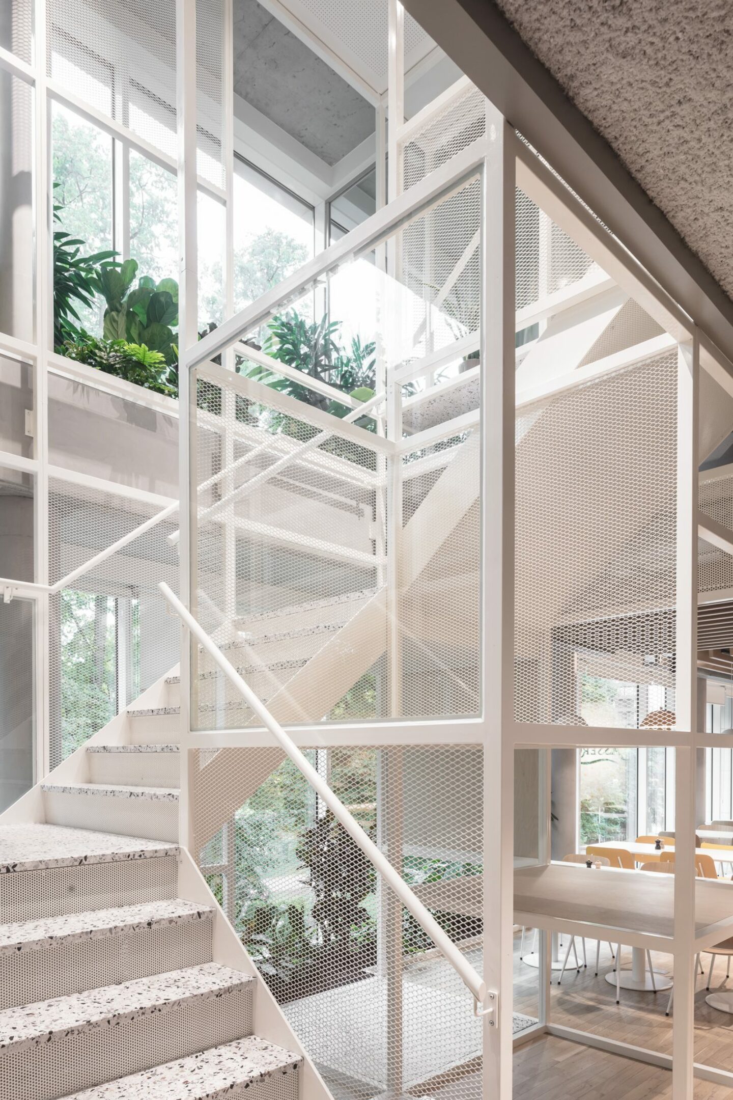
A staircase as display element: The central staircase is conceived as a display element in which Google can exhibit innovations or tell a story. Anyone climbing the stairs passes, as it were, through a search engine.
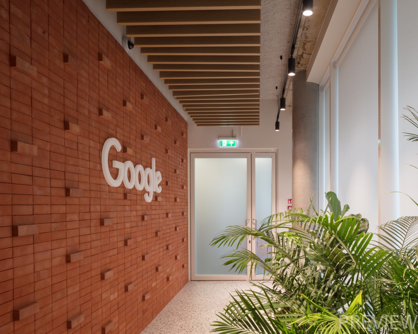
A brick wall with Google logo: The red wall behind the reception desk clearly shows what Google stands for. Bricks were glued by a robot using digital data to form the Google logo.
Graphics
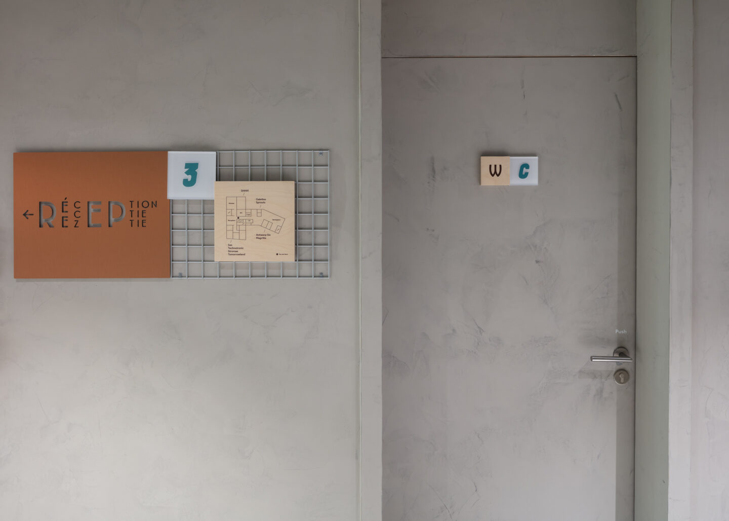
As with the materials, Belgian culture was the starting point for the graphics, which PUUR developed in tandem with design agency TODAY. The diversity that epitomises Belgium as a country of contrasts is echoed in the signage through the choice of multiple fonts and the use of diverse materials, such as wood, acrylic glass and stickers.
The red wall behind the reception desk clearly shows what Google stands for. Based on digital data, a robot used traditional bricks to create the Google logo.
Project Info
2019
Brussels, Belgium
2400m²
